On page 35 of The Neatest Little Guide to Stock Market Investing, you learn the following:
MACD
The letters stand for moving average convergence divergence, which sounds like a marital relations map, but is a stock indicator created by Gerald Appel ... It compares the exponential moving average of a stock’s price from two time periods, usually 12 and 26 days or weeks or months, and then plots that difference to show a trend.
It’s generally treated as an acronym and pronounced “Mac-Dee,” but some traders consider it an initialism and say each letter: MACD.
On page 143, the book goes into more detail:
This measurement shows trends in an investment by looking at the difference between fast and slow exponential moving averages, or EMAs, of its closing prices. An exponential moving average is similar to the simple moving average we looked at above, but it places more weight on recent prices than on past ones, making it react more quickly to trend changes. Fast and slow refer to the time periods used, with fast being a short one and slow being a long one. As these averages come together and move apart, they send hints about future direction. That’s why the name of the measurement is moving average convergence divergence, or MACD.

The MACD message is composed of three parts:

MACD: The 12-period exponential moving average minus the 26-period. This is the difference between fast and slow we just discussed above, and period can refer to hours, days, weeks, months or any other time segment. The default is days, and that’s what we’ll use.

MACD Signal Line: The 9-period exponential moving average of the MACD. This is the trend of the difference between the 12-period trend and the 26-period trend.

MACD Histogram: The MACD minus the MACD Signal Line. A histogram is commonly known as a bar chart, and this one shows whether MACD is above, the same as, or below its signal, and by how much.
Note that there actually is a difference between histograms and bar charts, despite their names being frequently swapped.
A histogram tracks ranges (or bins) of continuous numerical data. In the case of MACD’s histogram, it reflects “…whether MACD is above, the same as, or below its signal, and by how much.” The data is continuous, which is why the bars usually touch each other or are very close, emphasizing the flow from one range to the next.
While a bar chart looks similar, it compares discrete categories. Each bar represents one of the categories, and the bars are spaced apart to show that the categories are not related continuously. For example, a bar chart might compare how many apples were sold versus how many oranges were sold. A histogram, by contrast, might show the number of oranges sold over time, capturing the flow of change within the same dataset.
With that bonus primer on record, let’s look at all three parts of MACD on a chart.
MACD Parts On A Chart
In the following chart from Fidelity, you can see the three parts of MACD in action:
Notice the red MACD line crossing above and below the green Signal Line, and the blue bars of the histogram indicating the direction and extent of the difference.
The purpose of all this is to signal good entry and exit points from a stock or other security. From page 145:
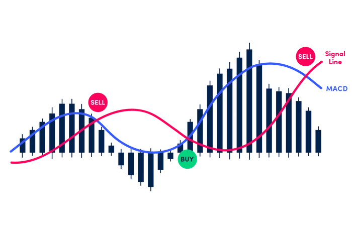
The main way to use MACD is by watching for the moving averages to cross over each other. A buy signal happens when the fast 12-period EMA crosses over the slow 26-period EMA, which causes MACD to cross over the zero line. A sell signal happens when the fast 12-period EMA crosses below the slow 26-period EMA, which causes MACD to cross below the zero line.

Another way to use this curious collection of lines is to watch for the MACD to cross the MACD Signal Line, which flips the histogram to the opposite side of the zero line. Flipping above it is a buy signal; flipping below it is a sell signal.
These are known as crossovers. Let’s see them in action.
MACD Crossovers
Fidelity agrees with the book, advising on its Learning Center page for MACD:
MACD crossing above zero is considered bullish, while crossing below zero is bearish. Secondly, when MACD turns up from below zero it is considered bullish. When it turns down from above zero it is considered bearish.
When the MACD line crosses from below to above the signal line, the indicator is considered bullish. The further below the zero line the stronger the signal.
When the MACD line crosses from above to below the signal line, the indicator is considered bearish. The further above the zero line the stronger the signal.
This is where the length of each histogram bar comes into play. Fidelity’s “further below the zero line” and “further above the zero line” are visually displayed by the depth or height of each bar, as you can verify in the following chart from Fidelity:
Here’s a simpler look at the dynamic, in an illustration by Oanda:
Back in my trading days, I zeroed in on MACD’s histogram, as explained on page 145 of The Neatest Little Guide to Stock Market Investing:
I find the bars of the histogram to be the friendliest way to follow MACD. Look how simple they are. Their depth or height tells us how stretched the investment is getting either down or up, their moves back toward zero show that something is changing, and their crossing over or under the zero line shows us a new trend has begun.

Notice that any way you choose to follow MACD will have you missing the very tops and bottoms of the price line but catching the bulk of the next trend. That’s the goal. If you’re happy only when catching absolute bottoms and absolute tops, you’ll rarely be happy. Give yourself a break by seeking most of a move, not all of it.
Does It Work?
Sorry to nerf the excitement, but not really.
If MACD worked perfectly, all you’d need to succeed in stocks would be to follow its buy and sell signals. Try it for a while, and you’ll come to the same conclusion you do with any timing indicator: it works sometimes. That makes it hard to separate genuine success from coincidence, rendering MACD unsuitable for a long-term, repeatable system.
Oanda agrees. From its MACD page:
Although this approach can deliver profitable results in many cases, the MACD’s signal can often fail. This can happen, for instance, when the MACD line and signal line cross over one another multiple times. If you took an entry every time they crossed, you could quickly lose numerous trades in a row.
They mention that many traders prefer to combine MACD with other metrics, but no metric is fully reliable, and — darn! — there’s no way of knowing whether this time is one of the reliable ones. You’re forever in the world of “sometimes” and “maybe,” no matter how sophisticated the timing indicators look.
But to me, MACD’s greatest shortcoming is that in most cases, it doesn’t tell you anything more than price movement itself tells you. As I often point out in The Kelly Letter, charting tools will tell you the price is rising when it’s rising, and falling when it’s falling. So, why not just stick with the price?
In the following chart of IJR from StockCharts, you will see both moments when the MACD histogram signaled good times to buy and sell, along with times when the signals were wrong. But more importantly, focus on the areas I’ve circled in red, which I’ll discuss below the chart:
What did the MACD histogram tell you in these circled areas? Simply that the price of IJR was falling when it was falling and rising when it was rising. It’s no easier to interpret the histogram than to interpret the price movement itself — and frankly, nobody can consistently predict even that.
There’s just no getting around that timing doesn’t work. Proper use of time, in a rigorous, repeatable system? That works.
In this IJR chart, for instance, you would be better off checking in every few months, determining whether the price of IJR was above or below a specified threshold, and placing your orders accordingly. In essence, that’s what my Signal system does.


One useful signal I have found to be fairly reliable is bullish divergences of MACD Histogram and price (price makes lower lows as histogram makes higher lows) especially on weekly charts.